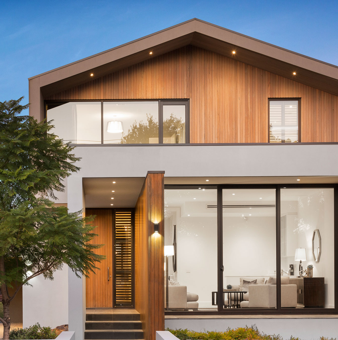
How to Use Colour Psychology in Your Home Design
Create a home that feels as good as it looks by understanding how colour affects your mood and well-being.
Have you ever stepped into a room and instantly felt relaxed or maybe just the opposite, like something was slightly off? Often, it’s not the furniture or the lighting. It’s the colour. Whether bold or subtle, colour has a huge impact on how a space feels and how we feel in it. It can energise us, help us unwind, spark creativity, or even leave us feeling unsettled if it’s not quite right.
That’s where colour psychology comes into play. It’s all about understanding how different shades and tones affect our moods, emotions, and even behaviours. When you use this knowledge in your home design, you’re not just decorating—you’re creating an atmosphere that supports how you want to live, relax, work, and connect.
In this post, we’ll walk through how to use colour psychology in different rooms of your home, explore what various colours evoke emotionally, and share some down-to-earth tips for putting it all into practice.
What is Colour Psychology?
At its core, colour psychology is the idea that colour influences how we feel and behave. While personal experiences, culture, and preferences do shape our reactions, research has shown that certain colours tend to trigger similar emotional responses across the board.
Warm colours like reds, oranges, and yellows tend to feel energising, lively, and social. They grab attention and create warmth. On the other hand, cool colours—think blues, greens, and purples are more calming and restful, often linked with relaxation, focus, and introspection. Neutrals like white, grey, beige, and black act as balancing tones. They’re versatile, grounding, and help tie other colours together in a room.
So, when you’re picking colours for your home, you’re not just choosing what looks good you’re setting the emotional tone of the space.
Room-by-Room: How to Use Colour Psychology at Home
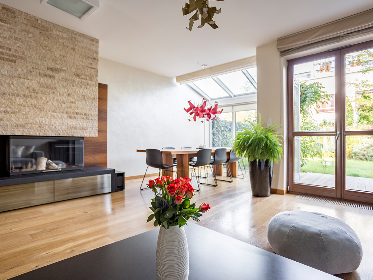
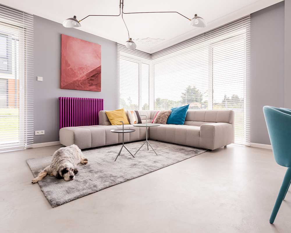
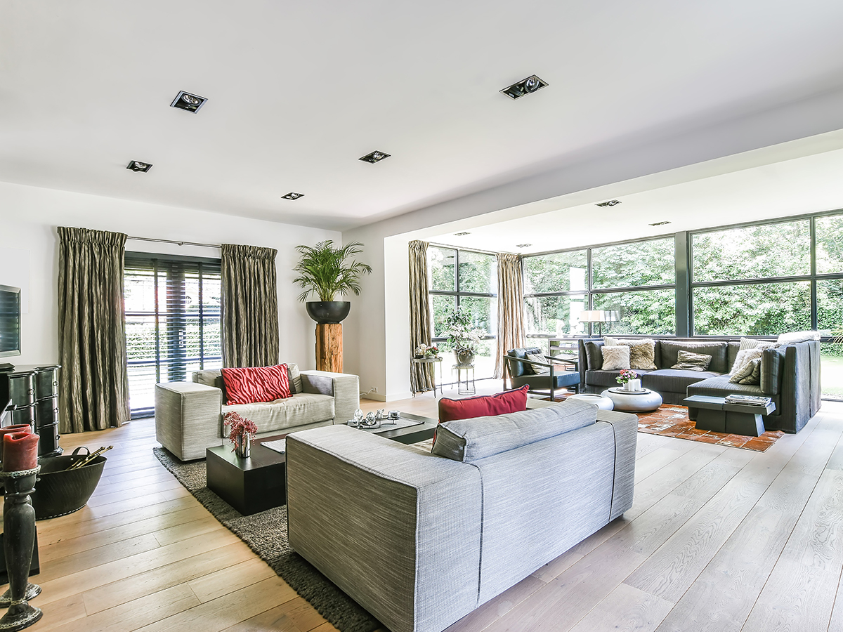
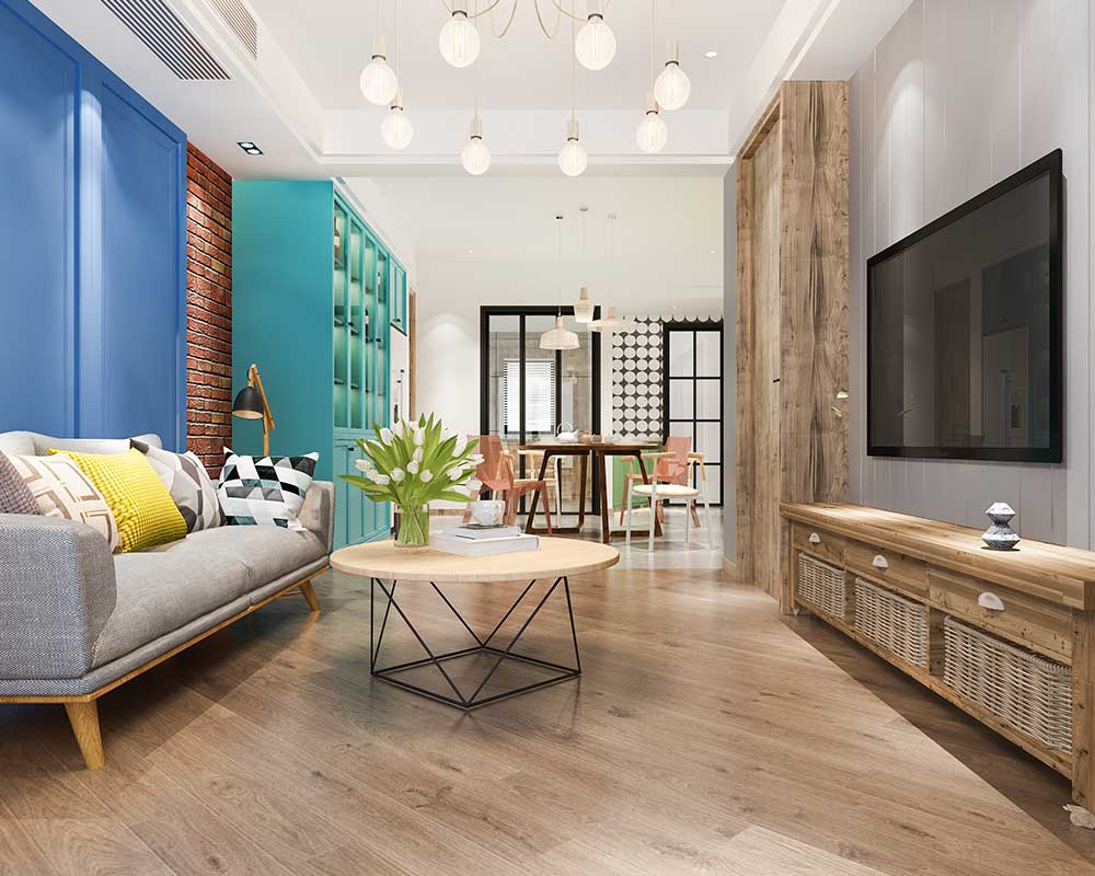
Your living space is often where you hang out with friends, catch up with family, or just chill after a long day. It should feel warm, welcoming, and easy going. Earthy tones like taupe, caramel, or warm tan are great for creating a cosy, inviting atmosphere. Shades of green like sage or olive bring a calming, grounded feel that still has a sense of life.
Want to introduce a bit more energy? Try muted oranges or soft terracotta. They can give the space a vibrant touch without going overboard. If the room gets a lot of natural light, don’t be afraid to go a little deeper with colour.
If it’s darker, lighter tones will help open it up. Try to steer clear of very bright reds or harsh blacks here. They can feel a bit intense and might make the space feel smaller or overstimulating.
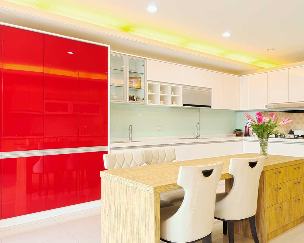
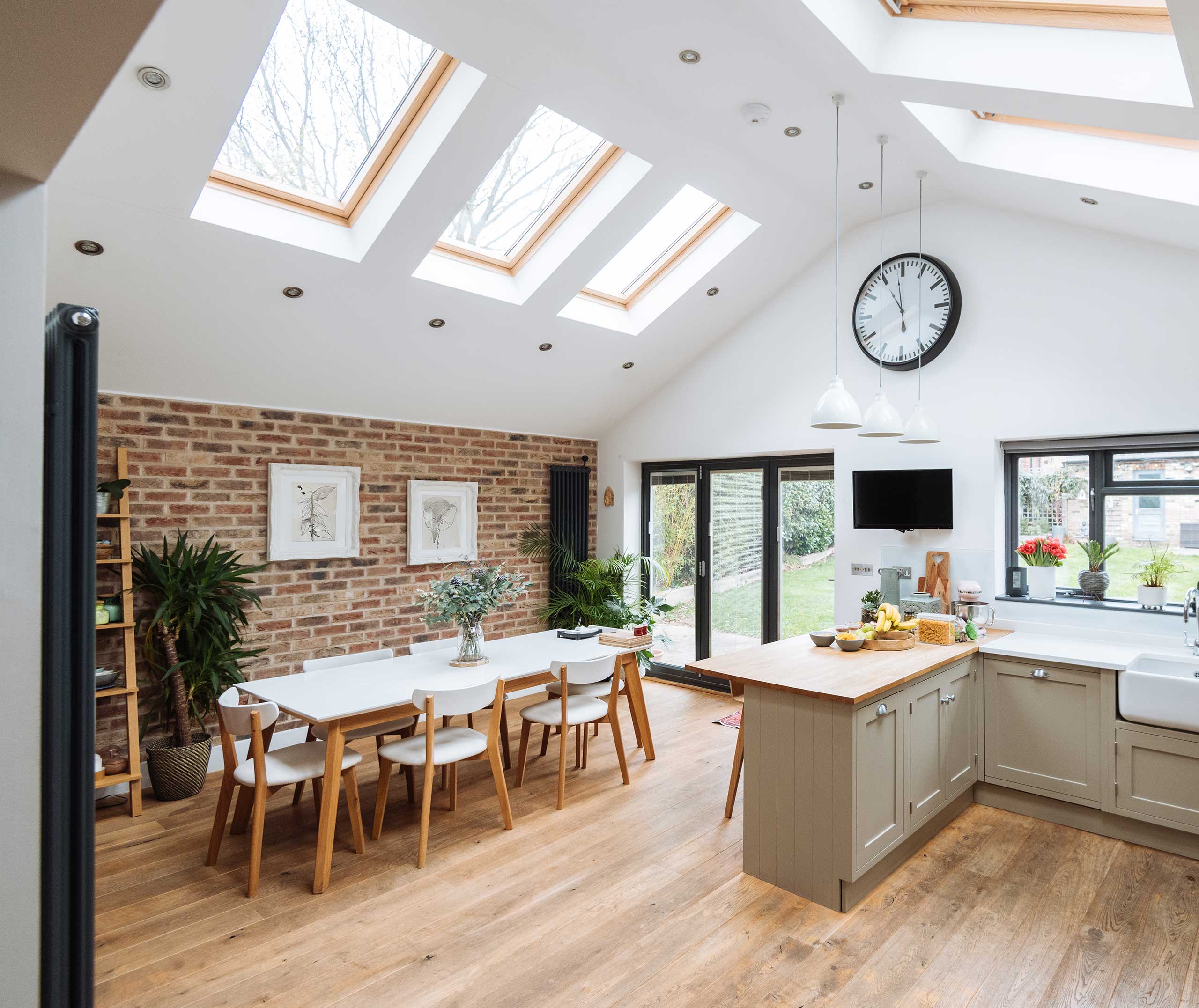
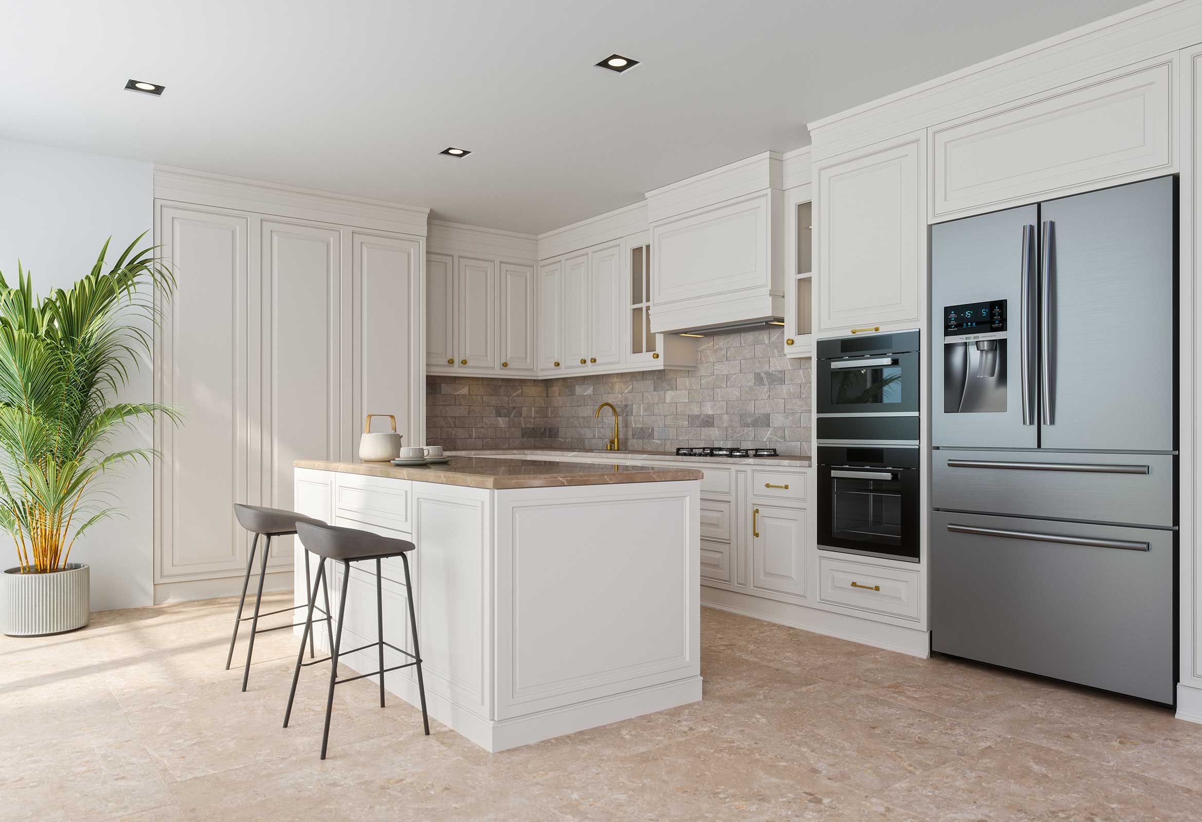
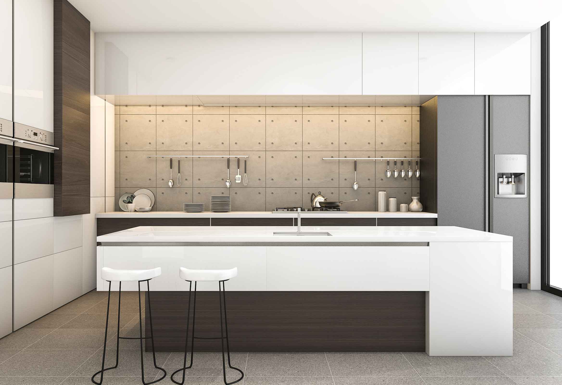
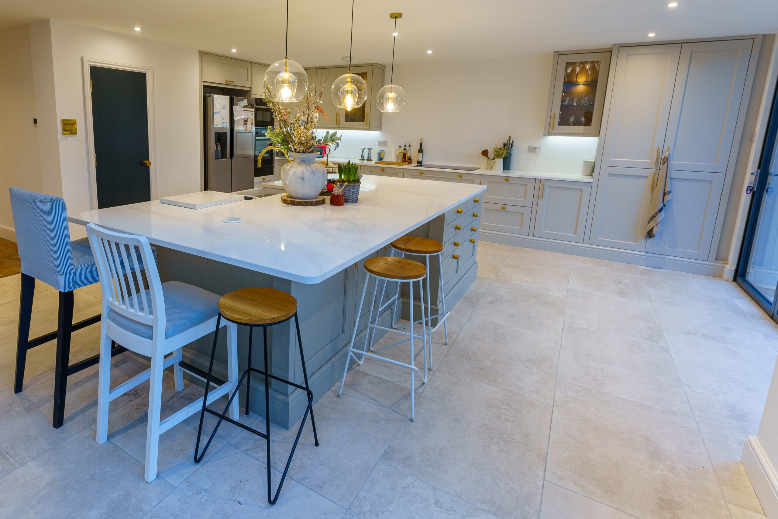
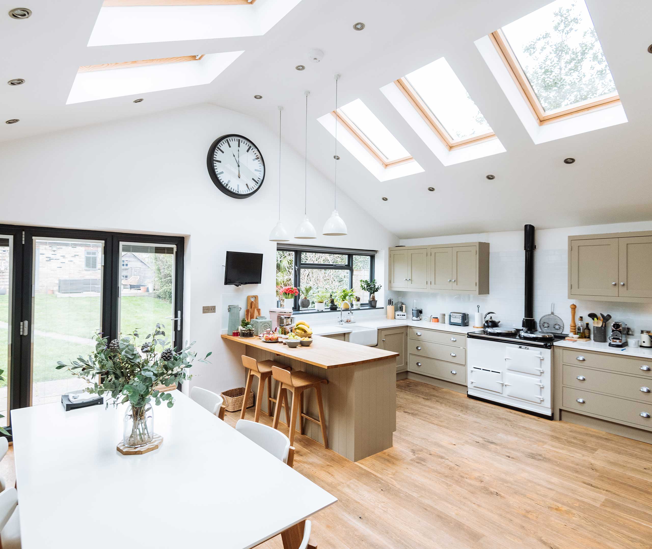
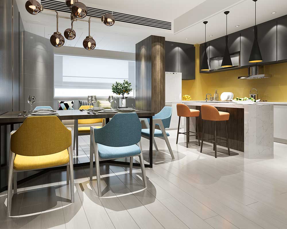
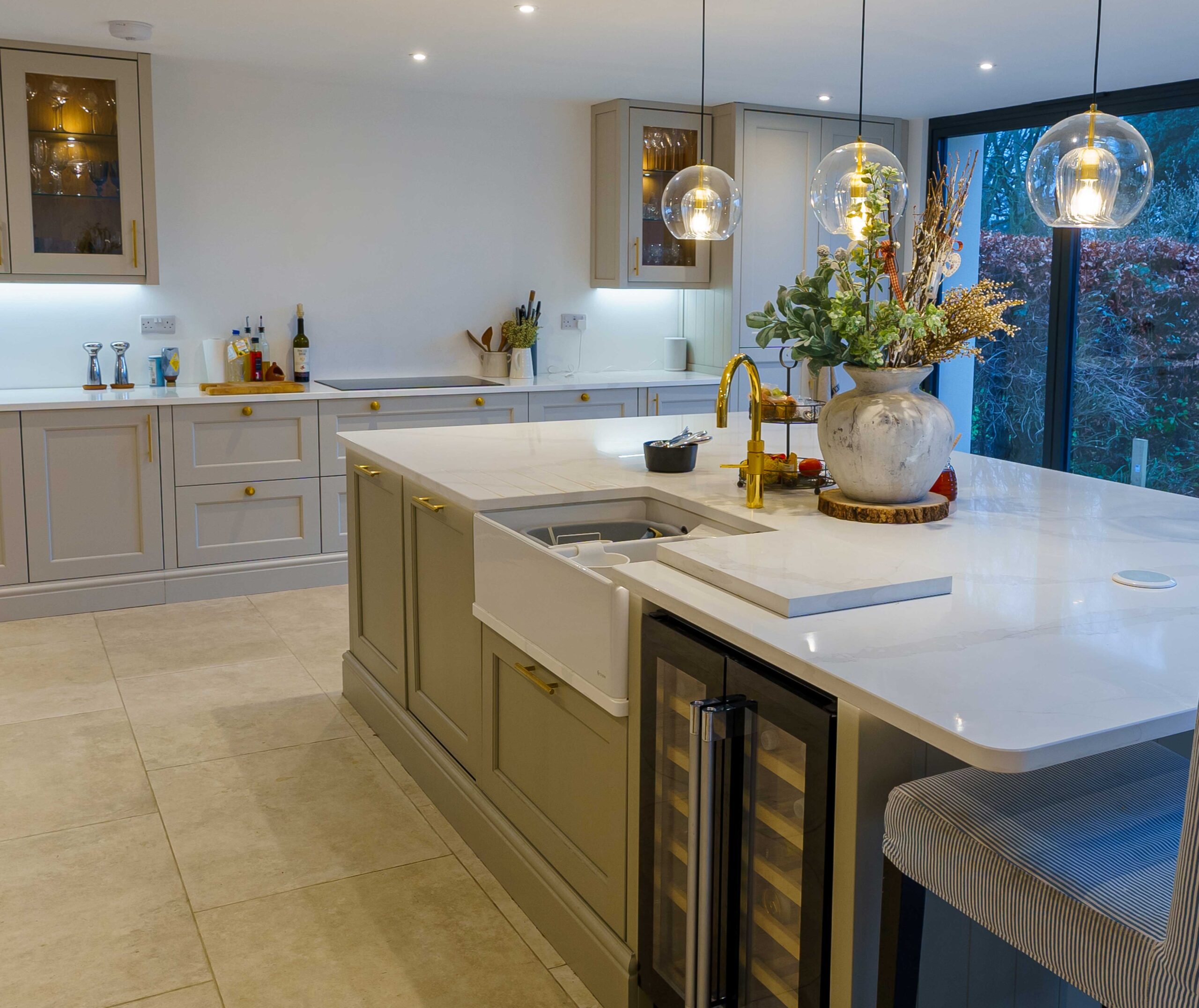
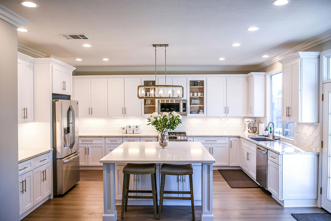
The kitchen tends to be one of the busiest spots in the home. It’s where we cook, connect, snack, chat and it often ends up being the place everyone gathers during parties. It should feel energising, fresh, and functional. Golden yellows, warm oranges, and soft reds are all colours that stimulate appetite and spark energy.
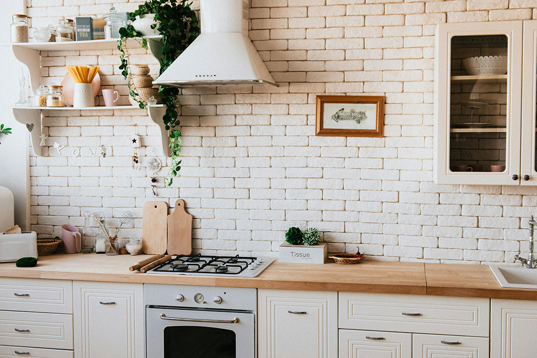
They make the space feel alive and sociable. Greens, especially lighter ones like sage or mint, give a clean, fresh vibe perfect for a space where food is prepared. Creamy whites or light woods help the kitchen feel bright and open.
Want to brighten things up? A yellow backsplash or green cabinetry can add personality without overwhelming the space. Just try to avoid darker greys or cold blues here they can feel a bit lifeless and don’t do your cooking any visual favours.
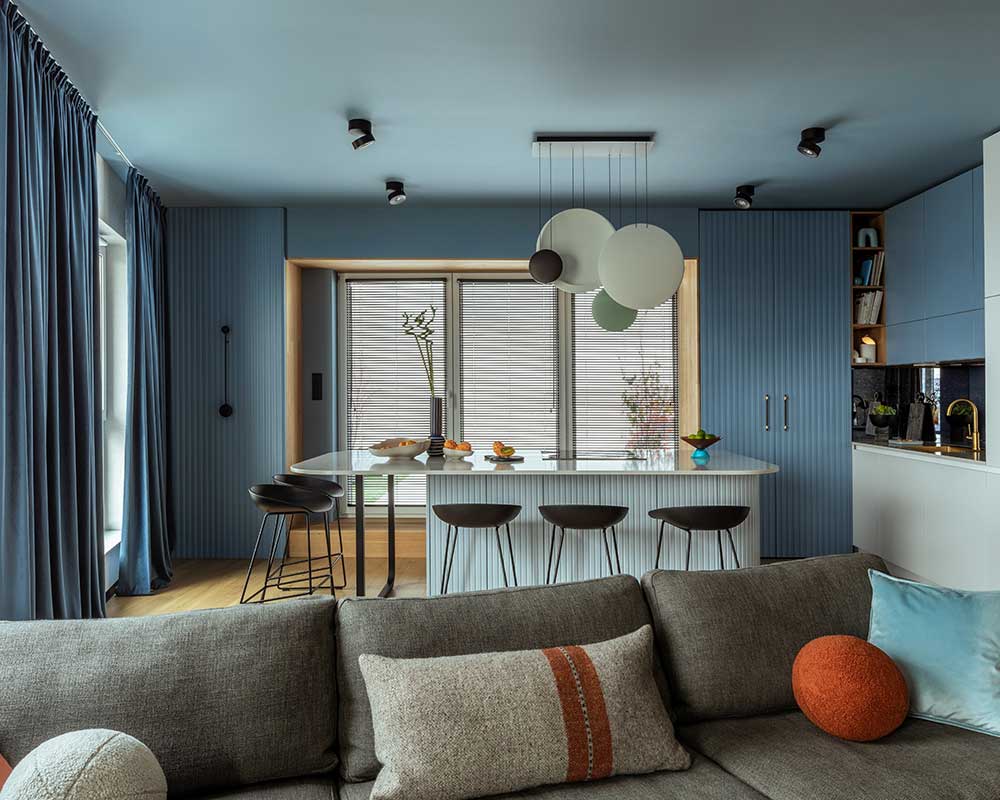
In a dining area, whether you’re hosting a formal dinner or a casual Sunday brunch, the space should feel inviting but intentional somewhere that encourages people to stay a while. Deep, rich tones like burgundy or aubergine can bring a sense of elegance and warmth. Navy or dark blue feels classic and intimate, especially when paired with warm wood tones or gold accents.
If you want something a bit softer, warm neutrals like mushroom or mocha keep things relaxed but still polished. Adding some mood lighting think pendants or candles alongside these deeper colours can really help set the tone for meaningful meals and conversations.
Bedrooms should feel like safe havens. They need to help you decompress, feel grounded, and get some solid rest. Blues are a go-to for good reason. Soft shades like sky, powder, or slate blue are known to reduce stress and promote calm. Lavender and light mauves are also incredibly soothing and can help balance emotions, making it easier to unwind.
Sage green or eucalyptus tones offer a peaceful, nature-inspired feel that’s ideal for rest. And if you’re after something a little warmer, soft greys and blush pinks bring a sense of comfort and calm without being too cold or too bright. The key here is layering add depth with textured throws, soft lighting, or natural fibres. Avoid bright reds, oranges, or neon colours. They’re too energising and can actually make it harder to fall asleep.
Even bathrooms can be turned into calming retreats. White is a classic bathroom colour because it conveys cleanliness, but it’s important to soften it with texture or warmer tones to avoid a sterile, hospital-like feel.
Try mixing in elements like stone, wood, or woven baskets. Soft blues, seafoam greens, and light greys all help to create that spa-like, refreshing vibe. Sandy beige or blush-toned pastels add a bit of warmth without darkening the room. Even just a pale blue wall or green tile accent can completely shift how this small space feels.
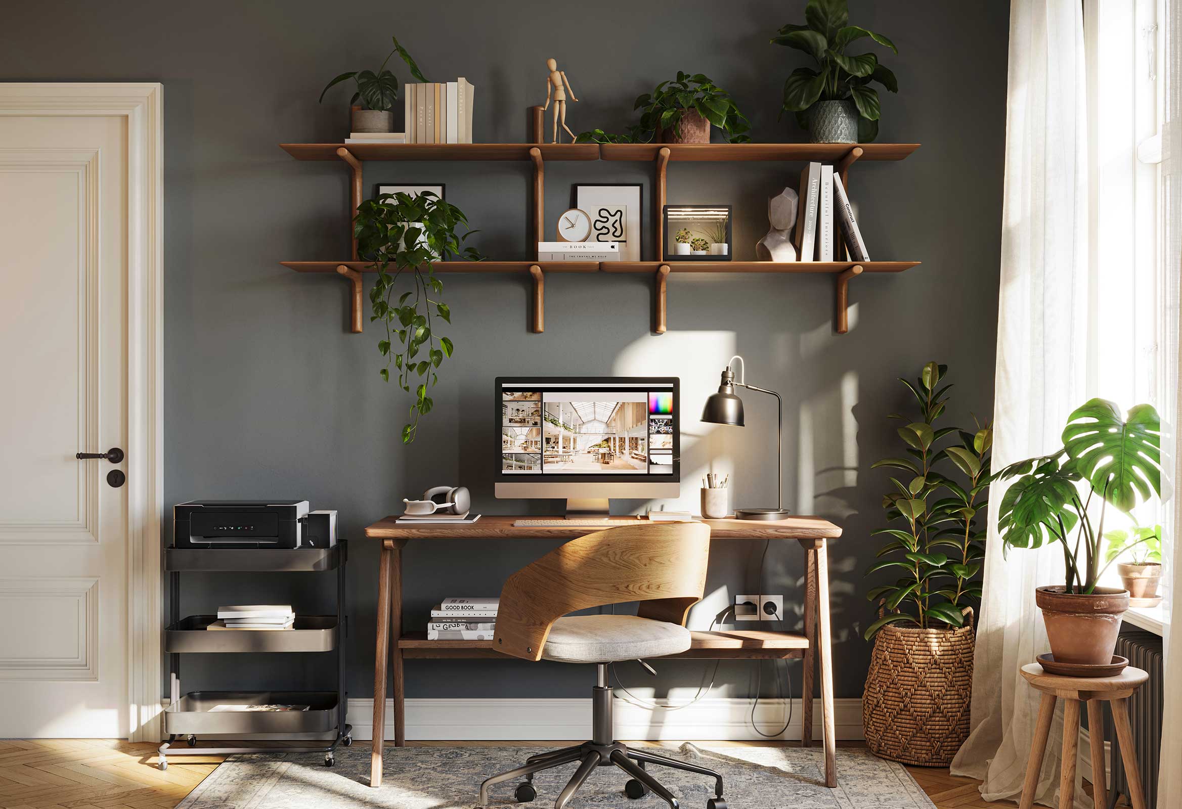
If you’re working from home, your surroundings can make a big difference in how productive and inspired you feel. Blue is fantastic for boosting concentration and logical thinking. It helps you stay clear-headed and productive.
Green is also a winner—it’s soothing to the eyes, especially if you’re staring at a screen for hours, and it creates a balanced, steady energy. If your work is more creative, touches of yellow can help spark optimism and new ideas just don’t go overboard, as too much yellow can become overstimulating. Try painting one feature wall a rich teal or deep blue, then balance it with neutral tones throughout the rest of the space to keep things grounded.
Tips for Using Colour Thoughtfully
Before grabbing a paintbrush, take some time to create a mood board. This helps you visualise how your chosen colours will play together and keeps your design plan focused.
If you’re not ready for a full-on colour commitment, introduce accent shades through smaller décor items cushions, rugs, artwork, or vases are great low-risk options. Always test your paint swatches in natural light.
Colours can look completely different in morning versus evening light.
When using bold or dark shades, pair them with soft neutrals to maintain balance. And even if each room has its own personality, using a consistent colour palette throughout your home helps everything flow together beautifully.
Final Thoughts
Designing a home isn’t just about matching cushions or choosing trendy furniture. It’s about building a space that reflects who you are and supports how you live. Colour plays a massive role in that—more than most people realise.
When you understand how different colours make you feel, and you use them intentionally, you can transform your home into something that works with you, not against you.
A calm, cool bedroom that helps you sleep. A lively, welcoming kitchen that encourages connection. A focused home office where ideas flow. That’s the power of colour psychology.
So next time you’re picking paint or shopping for décor, pause and ask: *how do I want to feel in this room?* Let that guide you, and you’ll create a home that doesn’t just look good—it feels right.
How GRK Architecture Can Help
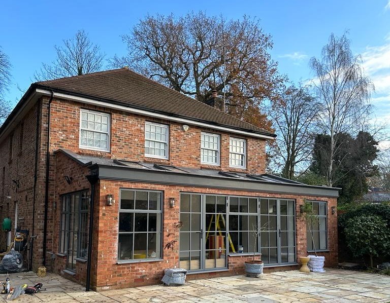
We are residential architects work with homeowners across Hampshire, Dorset, and Surrey to design spaces that feel as good as they look. Whether you’re planning a renovation, an extension, or a whole new build, we take time to understand how you live—so the spaces we design truly support your lifestyle.
From colour palettes and lighting to layout and flow, we bring together design psychology, creativity, and technical expertise to craft homes that feel intentional, calm, and uniquely yours.
We offer a free 30-minute consultation where we’ll get to know what you’re looking for and explore how we can help.
Book your consultation here – we’d love to hear more about your project.
“`